The Rise of Accessible Beige Kitchen Cabinets: A Timeless Choice
Accessible Beige Kitchen Cabinets: The Perfect Warm Neutral
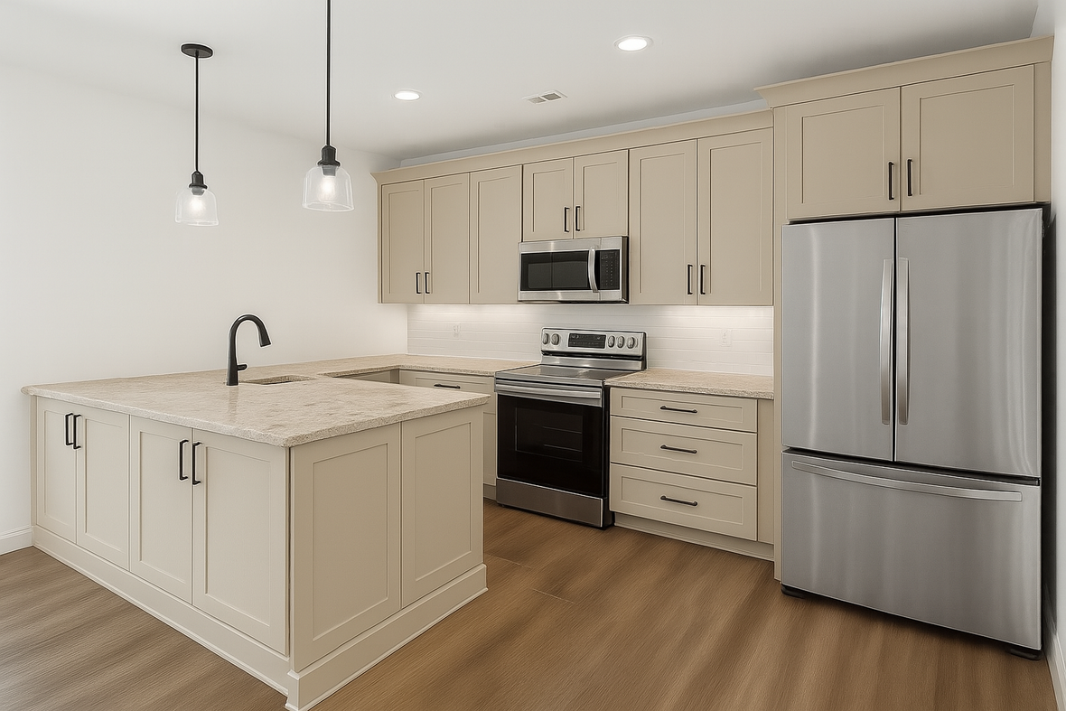
While stark white kitchen cabinets dominated design trends for years, 2024 ushered in a new preference for warmer, more inviting neutrals and this trend is here to stay. Homeowners are continuing to move away from the clinical feel of pure white and embracing colors that create a cozy, welcoming atmosphere in their homes. Leading this shift is Sherwin Williams Accessible Beige paint, a sophisticated paint color that perfectly bridges the gap between classic and contemporary kitchen design.
This comprehensive guide will help you decide if accessible beige kitchen cabinets are right for your space. You’ll discover why this versatile paint color has become the go-to choice for designers, learn how to pair it with the perfect hardware and countertops, and get expert tips for achieving professional results in your own home.
What Are Accessible Beige Kitchen Cabinets?
Sherwin Williams Accessible Beige paint (SW 7036) represents a new generation of neutral paint colors that homeowners are excited to embrace. Unlike traditional beige tones that can feel yellow or orange, this accessible beige paint color features subtle gray undertones that place it firmly in the greige category - a perfect blend of gray and beige.
The technical specifications tell an important story about this paint’s performance. With a light reflectance value (LRV) of 58, Accessible Beige paint color sits in the medium-light range on the scale. This light reflectance means it reflects enough light to keep kitchens feeling bright and airy, while still providing the warmth and depth that pure white kitchen cabinets lack.
What makes this paint color particularly appealing is its chameleon-like quality. Depending on the lighting in your space, Accessible Beige can appear slightly different throughout the day, adapting to both natural and artificial light sources. This versatility has made it one of the most popular paint colors for kitchen renovations in 2024.
The color works beautifully across a variety of kitchen styles. Whether you’re inspired by modern minimalism, traditional elegance, or farmhouse charm, accessible beige cabinets create a neutral backdrop that won’t compete with your design elements. It’s this adaptability that has designers calling it the “new neutral” for kitchen cabinetry.
Why Accessible Beige is Perfect for Kitchen Cabinets
The appeal of accessible beige kitchen cabinets extends far beyond their attractive appearance. This paint color offers a safe choice for homeowners who want something more interesting than white but aren’t ready to commit to darker or bolder cabinet colors.
One of the strongest arguments for choosing Accessible Beige is its timeless quality. While trendy paint colors can make your kitchen feel dated within a few years, this warm neutral has staying power. You won’t find yourself wanting to repaint your kitchen cabinets in a couple of years because the color went out of style.
From a practical standpoint, these cabinets are incredibly forgiving in busy kitchen environments. The color naturally hides fingerprints, smudges, and small marks much better than pure white kitchen cabinets. This makes them a great option for families with children or anyone who wants low-maintenance cabinetry. For more information on making the right choice for your home, consider comparing stained vs painted cabinets.
The versatility of Accessible Beige paint also shines when it comes to paint sheens. Whether you choose satin for a subtle finish or semi-gloss for maximum durability and ease of cleaning, this color looks perfectly balanced. The warm undertones prevent it from appearing flat or lifeless, even in lower-sheen applications.
Perhaps most importantly, accessible beige paint creates an inviting atmosphere that makes kitchens feel like the heart of the home. They add warmth without making spaces feel dark or cramped, striking an ideal balance that works in both large and small kitchens.
Accessible Beige Cabinet Undertones and Color Characteristics
Understanding the undertones in Accessible Beige is crucial for successful kitchen design. The gray undertones are what set this color apart from traditional “builder’s beige” shades that often lean yellow or orange. These cooler undertones keep the color feeling fresh and contemporary rather than dated.
In certain lighting conditions, you may notice subtle green undertones emerging. This isn’t a flaw - it’s part of what gives Accessible Beige paint its sophisticated, nuanced character. These undertones can actually be an asset, as they help the color harmonize with a wide variety of other colors and materials in your kitchen.
The way this paint color responds to different lighting throughout the day is truly remarkable. In east-facing kitchens, morning light makes the cabinets appear lighter and warmer, while afternoon light may bring out more of the gray undertones. North-facing rooms tend to emphasize the cooler aspects of the color, making it appear slightly more gray than beige.
This chameleon quality means you’ll want to test samples extensively before making your final decision. Paint large sample boards and observe them at different times of day and under various lighting conditions. What looks perfect in morning light might feel too gray in the evening, or vice versa.
The complexity of these undertones is exactly what makes the Accessible Beige paint color such a versatile choice. It can lean warm when paired with brass hardware and natural wood, or feel more contemporary when combined with black fixtures and white countertops. This adaptability ensures your cabinets will work with changing trends and evolving design preferences.
Best Hardware and Finishes for Accessible Beige Cabinets
The hardware you choose can dramatically transform the overall look of your accessible beige kitchen cabinets. Each finish creates a different mood and style, so it’s important to select options that align with your design goals.
Brass hardware has become increasingly popular with Accessible Beige painted cabinets, and for good reason. The warm tones in brass complement the beige beautifully, creating a sophisticated, lived-in feel. Unlacquered brass develops a natural patina over time, which adds character and depth to your kitchen. This combination works particularly well in transitional and traditional kitchen designs.
For those who love modern aesthetics, black hardware offers striking contrast against the warm neutral cabinets. Matte black pulls and knobs create clean lines and contemporary appeal without overwhelming the subtle beauty of the paint color. This pairing has become a favorite among designers creating modern farmhouse and minimalist kitchen designs.
Polished nickel provides a classic, timeless option that works beautifully with Accessible Beige paint color. The subtle shine adds elegance without being too flashy, and the cooler tones in the hardware balance nicely with the gray undertones in the paint. This combination is particularly effective in traditional and transitional kitchen styles.
Oil-rubbed bronze hardware emphasizes the timeless quality of Accessible Beige paint. This finish is perfect for homeowners who want a more rustic or traditional feel in their kitchen. The darker tones in the bronze create nice contrast while maintaining the warm, welcoming atmosphere.
Some designers are now experimenting with mixed hardware finishes, combining elements like brass and stainless steel to create visual interest and depth. When done thoughtfully, this approach can add a custom, high-end feel to your kitchen design.
Countertop Pairings with Accessible Beige Kitchen Cabinets
The neutral nature of Sherwin Williams Accessible Beige paint makes it compatible with a wide variety of countertop materials, giving you lots of flexibility in your kitchen design. Your choice will largely depend on your preferred style and the overall mood you want to create.
White quartz with gray veining is one of the most popular countertop choices for accessible beige kitchen cabinets. This pairing creates a clean, modern look while tying in with the gray undertones of the paint color. The contrast keeps the design from feeling too monochromatic while maintaining a cohesive color palette.
For those seeking dramatic sophistication, soapstone countertops create a stunning combination with Accessible Beige kitchen cabinets. The dark, rich tones of soapstone provide beautiful contrast while maintaining the warm, inviting feel of the space. This pairing works exceptionally well when combined with brass hardware for a truly elegant look.
Natural marble, particularly Carrara or other warm-toned varieties, complements the beige tones without creating visual competition. Many designers use marble for both countertops and backsplashes to create a seamless, luxurious appearance. The natural veining in marble adds visual interest while keeping the overall palette cohesive.
Butcher block and other natural wood countertops add warmth and texture that pairs beautifully with Accessible Beige paint. This combination is perfect for farmhouse or transitional kitchen styles, creating a welcoming, lived-in feel that’s both practical and beautiful.
When considering granite options, look for varieties in warm, earthy neutrals that won’t clash with the cabinet color. Avoid granites with strong yellow or overly cool blue tones, as these can create an unharmonious color combination.
Wall Colors and Design Combinations
Selecting the right wall color to complement your accessible beige kitchen cabinets is essential for creating a cohesive, well-designed space. The goal is to create a flowing color palette that enhances the beauty of your cabinets while maintaining visual interest.
Sherwin Williams Alabaster paint color is a top choice for walls and trim when paired with Accessible Beige cabinets. This crisp, slightly warm white provides clean contrast while maintaining the inviting atmosphere. Alabaster walls help keep the space feeling light and airy, preventing the kitchen from feeling too dark or enclosed.
A monochromatic approach using different shades of beige can create a sophisticated, layered look. By varying the tones slightly between walls, cabinets, and trim, you create subtle depth and interest without introducing competing colors. This approach works particularly well in open-concept homes where you want a seamless flow between spaces.
Cool gray walls can provide beautiful contrast with Accessible Beige paint, but this combination requires careful consideration. Choose grays that aren’t too blue or cold, as these can clash with the warm undertones in the cabinets. The right gray can create a balanced, contemporary feel that’s both sophisticated and welcoming.
Additional warm white options work well for homeowners who want to maximize light reflection while maintaining the cozy feel that Accessible Beige paint provides. These combinations create bright, cheerful kitchens that feel both modern and timeless.
Lighting Considerations for Accessible Beige Cabinets
The way light interacts with Accessible Beige is one of its most important characteristics to understand. Different lighting conditions can dramatically affect how the color appears, making it crucial to test thoroughly before committing to this paint color.
East-facing kitchens benefit from morning sunlight that makes Accessible Beige paint appear lighter and warmer. As the day progresses and the quality of light changes, you may notice the undertones shifting slightly. This natural variation adds visual interest and keeps the color from feeling static.
North-facing rooms present different challenges, as they receive less direct sunlight and tend to emphasize the cooler undertones in the paint. In these spaces, Accessible Beige may appear more gray than beige, which can actually be quite beautiful if that’s the look you’re going for.
Artificial lighting also plays a significant role in how your cabinets will look. LED bulbs with warmer color temperatures (around 2700K-3000K) tend to enhance the beige tones, while cooler LEDs can bring out more of the gray undertones. Consider your lighting plan carefully and test your cabinet samples under the actual lights you’ll be using.
The key to success with Accessible Beige is extensive testing. Paint large sample boards and observe them throughout the day and under different lighting conditions. This investment in time will save you from disappointment and ensure you love your cabinets in every light.
Accessible Beige vs. Other Popular Cabinet Colors
Understanding how Accessible Beige compares to other trending cabinet colors can help you make the best decision for your kitchen. Each color has its own strengths and ideal applications.
|
Paint Color |
Undertone |
Light Feel |
Best For |
2024 Trend Status |
|---|---|---|---|---|
|
Accessible Beige |
Warm greige with gray undertones |
Medium-light, cozy |
Traditional, transitional, farmhouse |
Rising popularity |
|
Agreeable Gray |
Light gray with beige hints |
Cooler, contemporary |
Modern, transitional |
Still popular but cooler |
|
Balanced Beige |
Deeper beige with pronounced gray |
Darker, more dramatic |
Statement kitchens |
Niche appeal |
|
Repose Gray |
Soft, cool gray |
Light, airy |
Contemporary, minimalist |
Declining slightly |
|
White Dove |
Pure white |
Brightest |
Ultra-modern |
Moving toward warmer tones |
The comparison between Accessible Beige and Agreeable Gray is particularly relevant, as both are popular Sherwin Williams colors. While Agreeable Gray leans cooler and more contemporary, Accessible Beige offers more warmth and works better in traditional and transitional kitchen styles.
Accessible Beige provides a middle ground between the stark brightness of pure white cabinets and the drama of darker colors like Balanced Beige. This positioning makes it a safe choice for homeowners who want something special but not too bold.
Design Mistakes to Avoid with Accessible Beige Cabinets
Even with its forgiving nature, there are several common mistakes that can undermine the beauty of accessible beige kitchen cabinets. Being aware of these pitfalls will help you create a kitchen you’ll love for years to come.
One of the most frequent errors is pairing Accessible Beige with overly cool-toned elements. Colors with strong blue or green undertones can clash with the warm gray undertones in the paint, creating an unharmonious color scheme. When selecting countertops, backsplashes, and wall colors, ensure they complement rather than compete with your cabinet color.
Inadequate lighting can make Accessible Beige appear dull, gray, or lifeless. This is particularly problematic in kitchens with limited natural light. Invest in quality lighting solutions, including under-cabinet lighting, pendant lights, and adequate general illumination to showcase the color’s beautiful warm undertones.
Not testing paint samples thoroughly is perhaps the biggest mistake you can make. The way Accessible Beige looks on a small paint chip or computer screen may be quite different from how it appears on your actual cabinets in your specific lighting conditions. Always test large samples and observe them throughout the day before making your final decision.
Hardware selection requires careful consideration. Overly ornate or cool-toned hardware can overwhelm the subtle beauty of Accessible Beige or create visual discord. Choose kitchen cabinet hardware that enhances rather than competes with your cabinet color.
Finally, avoid creating a space that’s too monochromatic without sufficient contrast. While Accessible Beige is beautiful, it needs supporting elements to create visual interest. Incorporate contrasting colors, textures, and finishes to prevent your kitchen from feeling bland or one-dimensional.
Conclusion
Accessible beige kitchen cabinets represent the perfect evolution from stark white cabinetry toward warmer, more inviting kitchen designs. This sophisticated paint color offers the best of both worlds: the timeless appeal of neutral cabinets with the warmth and character that make kitchens feel like home.
The versatility of Sherwin Williams Accessible Beige makes it an excellent choice for a variety of kitchen styles and design preferences. Its medium light reflectance value ensures your space stays bright, while the subtle gray undertones prevent it from feeling dated or yellowed like traditional beige colors.
Whether you pair it with brass hardware for a traditional feel, black fixtures for modern appeal, or experiment with mixed finishes for a custom look, Accessible Beige provides a beautiful foundation for your kitchen design. The key to success lies in careful planning, thorough testing, and attention to the details that make the difference between good and exceptional results.
As you plan your kitchen renovation, consider how this trending neutral can create the warm, welcoming space you’ve always envisioned. Test samples in your actual lighting conditions, choose complementary materials thoughtfully, and don’t hesitate to consult with design professionals to achieve the kitchen of your dreams.
To ensure you get the perfect look and feel for your space, consider working with one of our expert kitchen cabinet designers. They can guide you through the selection process, offer personalized ideas and inspiration, and help you choose the ideal combination of cabinets, hardware, and countertops. Partnering with a professional means you’ll have confidence in your choices and a kitchen that truly reflects your style and needs. Reach out today to start creating the kitchen of your dreams with free expert support every step of the way.


