Sherwin Williams Creamy: The Ultimate Guide to Perfecting Your Space
Sherwin Williams Creamy: Complete Paint Color Guide for 2024
Most people spend time searching for the perfect warm white that doesn’t look too yellow in bright light or too gray in a dark room. Sherwin Williams Creamy SW 7012 has emerged as a beloved solution, offering the ideal balance between warmth and versatility that makes it an amazing choice for enhancing the aesthetics of modern homes.
This comprehensive guide covers everything you need to know about this popular paint color, from its technical properties to real-world applications. Whether you’re considering creamy walls for your living space or exploring it as a kitchen cabinet color, you’ll find detailed insights to make the best decision for your home.
What is Sherwin Williams Creamy?
Sherwin Williams Creamy SW 7012 is a warm, off-white paint color with subtle yellow undertones that creates an inviting, sophisticated atmosphere in any space. Unlike stark pure white or cooler gray-based off whites, Creamy strikes a perfect balance between brightness and warmth, making it incredibly versatile for modern interior design.
This paint color has gained tremendous popularity as homeowners move away from the clinical feel of pure white walls toward more welcoming, livable spaces. Creamy offers the light-reflecting benefits of white paint colors while adding just enough warmth to prevent that sterile, cold appearance that many people want to avoid.
The color works as an excellent alternative to traditional white cabinets and stark white trim, offering a softer, more sophisticated approach to neutral design. As a versatile neutral color, its creamy off white appearance provides depth and character that pure black and white schemes often lack, creating spaces that feel both bright and cozy.
What makes Creamy particularly appealing is its ability to complement various design styles, from traditional farmhouse aesthetics to contemporary spaces. The paint color’s undertones are sophisticated enough for upscale homes while remaining approachable for everyday living.
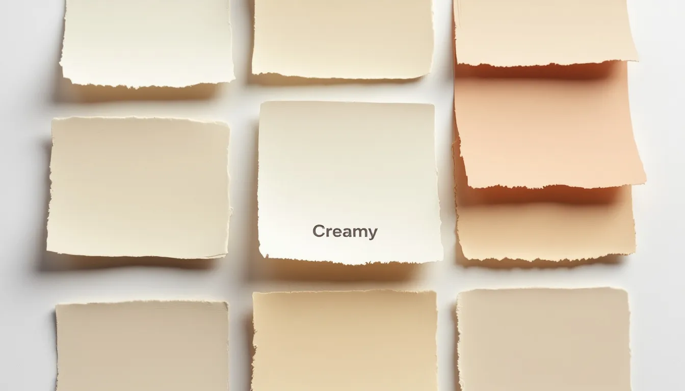
When choosing a paint color like Creamy, it's important to evaluate the color's undertones. Side-by-side comparisons can help reveal the subtle hue nuances and primary undertones, such as yellow, that influence how the color will appear in your space.
Compared to other creams, Creamy stands out for its balanced warmth and subtlety. Creams are essentially light yellows toned down with neutrals, resulting in a range of shades that can suit different interior design needs.
Sherwin Williams Creamy Color Properties
Understanding the technical properties of creamy sherwin williams helps explain why it performs so well in various lighting situations. With a Light Reflectance Value (LRV) of 81, Creamy reflects a significant amount of light, making rooms feel bright and spacious while maintaining its warm character.
The LRV scale ranges from 0 (pure black) to 100 (pure white), placing Creamy firmly in the very light category. This high reflectance value means the color will help bounce light around a room, making spaces feel larger and more open. However, the LRV also means that in extremely bright conditions, Creamy can appear slightly lighter than expected.
Unlike pure white paint colors that can feel stark and cold, Creamy’s formulation includes carefully balanced pigments that create its signature warmth. The color maintains excellent coverage and durability, typical of Sherwin Williams’ premium paint formulations, ensuring a beautiful kitchen or any other space maintains its appearance over time. Sherwin Williams Creamy is also available in a durable finish, making it ideal for high-traffic or moisture-prone areas like kitchens where longevity, stain resistance, and easy maintenance are important.
The paint’s classification sits in an interesting middle ground - it’s not quite a traditional cream color, not exactly an off white, and definitely not a pure white. This unique positioning makes it incredibly versatile for coordinating colors and creating harmonious color schemes throughout a home.
Understanding Creamy’s Undertones
The magic of Williams Creamy lies in its complex undertone structure. The primary yellow base creates the creamy appearance that gives the color its name, but this yellow is significantly softened by neutral gray and beige elements that prevent it from looking overly golden or brassy. Note that these subtle undertones play a crucial role in how Creamy is perceived in different spaces.
These yellow undertones become more or less noticeable depending on lighting conditions and surrounding colors. In south facing light, the warmth becomes more pronounced, while in cooler lighting situations, the yellow recedes and the color appears more neutral. You may notice the yellow undertones more under warm lighting and less under cool lighting. This adaptability is what makes Creamy such a reliable choice for various rooms throughout a home.
Subtle hints of pink and green can appear in certain lighting conditions, adding to the color’s complexity. These secondary undertones are barely perceptible but contribute to the sophisticated, multi-dimensional quality that distinguishes Creamy from simpler off-white alternatives.
When comparing undertone intensity to similar colors like Dover White or other warm whites in the Sherwin Williams collection, Creamy falls in the moderate range - warm enough to feel inviting but controlled enough to remain versatile.
How Lighting Affects Sherwin Williams Creamy
Natural light direction plays a crucial role in how Creamy appears on your walls. Understanding these lighting effects helps ensure you’ll love the color in your specific space, regardless of the time of day or season.
In north facing space locations, where cooler, more indirect light dominates, Creamy’s yellow undertones become more subdued. The color appears softer and more neutral, which can be perfect for creating calm, sophisticated atmospheres. However, in rooms with very limited natural light, Creamy might appear slightly gray or muted.
South and west-facing rooms receive warm, direct sunlight that enhances Creamy’s yellow undertones. In these lighting situations, the color becomes more golden and rich, sometimes appearing almost like a light cream rather than an off white. In very bright, sunlit rooms, Creamy can sometimes wash out, appearing less noticeable due to its high light reflectance. While this can create beautiful, sunny atmospheres, it’s important to test the color in these conditions to ensure the warmth doesn’t become overwhelming.
Artificial lighting also significantly impacts how Creamy appears. Warm lighting from incandescent bulbs or warm LED fixtures enhances the color’s yellow undertones, while cooler fluorescent or daylight-balanced LED lighting can make the color appear more neutral or even slightly gray.
The key to success with sw creamy is testing large samples in your specific lighting conditions at different times of day. What looks perfect in morning light might appear quite different in evening artificial lighting.
Color Psychology and Emotions of Creamy
Sherwin Williams Creamy is more than just a paint color—it’s a mood enhancer for your home. Thanks to its gentle yellow undertones, this creamy off white instantly creates a sense of warmth and comfort in any room. When used on kitchen cabinets or walls, Creamy helps foster an inviting atmosphere where people naturally want to spend time, making it a favorite for gathering spaces like kitchens and living rooms.
The light off white nature of Creamy reflects light beautifully, giving rooms a bright, airy feel without the starkness of pure white. This makes spaces feel more open and welcoming, which is especially beneficial in areas where you want to encourage relaxation and togetherness. The subtle warmth of Creamy’s undertones can make even large or open rooms feel cozy and intimate, while in smaller spaces, it prevents the room from feeling cold or cramped.
Pairing Creamy with warm tones and wood tones further enhances its comforting effect. The combination of creamy walls and natural wood creates a harmonious, grounded environment that feels both timeless and fresh. Whether you’re painting cabinets, walls, or both, Creamy’s ability to create a soothing, cheerful ambiance makes it an excellent choice for any space where you want to promote positive emotions and a sense of well-being.
Best Uses for Sherwin Williams Creamy
Creamy excels as a wall color throughout the house, particularly in living rooms, bedrooms, hallways, and dining areas where you want to create warm, welcoming atmospheres. The color works beautifully in open-concept spaces where you need a unifying neutral that flows seamlessly from room to room. However, while Creamy is versatile, it may not be a good fit for every space—especially if the lighting or decor does not complement its warm undertones.
For kitchen and bathroom walls, Creamy provides an excellent backdrop that’s warm enough to feel inviting but light enough to make spaces feel clean and bright. In bathrooms, the color pairs beautifully with white fixtures and creates a spa-like atmosphere when combined with natural materials.
However, Creamy has limitations when it comes to trim and molding applications. The color’s warmth can create insufficient contrast when used on trim against Creamy walls, and it may appear too yellow when used as trim color against cooler wall colors. Most designers recommend using a crisp white trim color instead.
For exterior applications, Creamy can work beautifully on traditional and transitional style homes, especially when paired with white or slightly lighter trim. The color provides more character than stark white exteriors while maintaining a classic, timeless appearance.
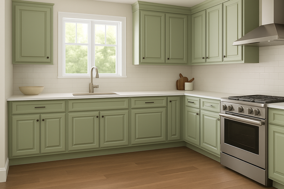
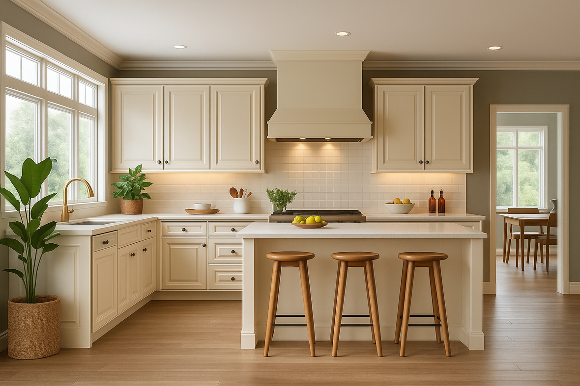
Creamy for Kitchen Cabinets
When considering making creamy your kitchen cabinet color, it’s important to understand both the opportunities and limitations. Creamy works exceptionally well for kitchen cabinets in traditional, transitional, and farmhouse-style kitchens where warmth and character are desired.
Slim shaker cabinets painted in Creamy create an particularly striking effect. These modern interpretations of classic shaker style feature narrower stiles and rails (typically 1-2 inches compared to 2.25-2.5 inches in regular shaker cabinets), creating a more refined, contemporary appearance. The clean lines of slim shaker cabinets allow Creamy’s warm undertones to shine without overwhelming the design.
The combination of Creamy and slim shaker style works especially well because the paint color’s softness balances the cabinets’ crisp, geometric lines. This pairing creates kitchens that feel both current and timeless, avoiding the stark coldness of pure white cabinets while maintaining a fresh, bright appearance.
When using Creamy for kitchen cabinets, consider pairing it with: blue gray cabinets,
-
Warm wood tones in flooring or islands
-
Brushed brass or oil-rubbed bronze hardware
-
Natural stone countertops in warm neutral tones
-
Backsplashes in subway tile or natural materials
However, be cautious about using Creamy cabinets in very bright kitchens with extensive south-facing windows, as the color may appear too yellow. Also consider that Creamy cabinets work best in kitchens with warm lighting rather than cool, bright LED fixtures.
Creamy for Trim and Molding
Most designers advise against using Creamy as a trim color due to several practical and aesthetic considerations. When used on trim against Creamy walls, the color provides insufficient contrast, creating a monotone appearance that lacks definition and architectural interest.
The yellow undertones that make Creamy beautiful on walls can appear too prominent on trim, especially in rooms with cool lighting or when contrasted against cooler wall colors. Trim painted in Creamy may read as yellow rather than white, which can look dated or unintentional.
Better trim alternatives that coordinate beautifully with creamy walls include:
-
Sherwin Williams Pure White (SW 7005) for crisp contrast
-
Benjamin Moore Cloud White for a softer but still contrasting option
-
Sherwin Williams Snowbound for a clean, bright trim that complements Creamy’s warmth
There are rare exceptions where Creamy trim might work, such as in very traditional interiors where a tonal, sophisticated approach is desired, or in historic homes where matching the original paint colors is important. However, these applications require careful consideration and professional guidance.
Sherwin Williams Creamy Color Comparisons
Understanding how Creamy compares to similar colors helps ensure you choose the best option for your specific needs and preferences. Comparing two colors side by side, such as Creamy and another shade, can help reveal subtle differences in undertones and brightness. Each of these warm whites and off whites has distinct characteristics that make them better suited for different applications.
These comparisons consider not just visual differences but also practical factors like performance in various lighting conditions, versatility for coordinating colors, and suitability for different room types and architectural styles.
Another popular off-white to consider is Greek Villa. Greek Villa is often used for exterior applications, such as outdoor fireplaces, and is known for its yellow undertones that become more noticeable in sunlight. This makes it a strong alternative to Creamy, especially for outdoor projects.
Creamy vs. Alabaster
Sherwin Williams Alabaster (SW 7008) and Creamy are frequently compared because both are popular warm whites with similar LRV values - Alabaster at 82 compared to Creamy’s 81. This minimal difference in brightness makes them nearly equivalent in terms of light reflection.
The key difference lies in their undertones. Alabaster has more neutral gray undertones with just a hint of warmth, making it slightly cooler than Creamy. This makes Alabaster more versatile for trim and cabinet applications, while Creamy excels as a wall color where more warmth is desired.
For cabinets, Alabaster is generally the better choice because its more neutral undertones work well with both warm and cool accent colors. Creamy’s yellow undertones can limit color palette options and may appear too warm for some design styles.
In terms of popularity, Alabaster has become one of the most widely used white paint colors due to its exceptional versatility. Creamy, while beloved by those who specifically want warmth, has a more specialized application range.
Creamy vs. Dover White
Dover White (SW 6385) offers noticeably more yellow undertone intensity compared to Creamy, making it a true warm white rather than Creamy’s more subtle off white character. Dover White has an LRV of 83, making it slightly brighter than Creamy.
The increased yellow intensity in Dover White makes it perform better in rooms with abundant cool lighting, where the extra warmth helps balance the cool light. However, in warm lighting situations, Dover White can appear quite golden, while Creamy maintains better balance.
Dover White works particularly well in rooms with wood floors and warm wood tones, as the color’s yellow undertones create beautiful harmony. Creamy offers more versatility with different flooring types and design styles.
Common misconceptions suggest these colors are nearly identical, but side-by-side comparisons reveal Dover White’s significantly more pronounced yellow character. Choose Dover White when you specifically want warmth and yellow undertones; choose Creamy when you want warmth with more restraint.
Creamy vs. Casa Blanca
Casa Blanca (SW 9010) provides an interesting contrast to Creamy with its LRV of 76, making it noticeably darker and more saturated. While both are warm colors, Casa Blanca reads more as a true cream while Creamy maintains its off white character.
The depth difference between these colors (LRV 81 vs 76) means Casa Blanca provides better contrast with white trim and creates more dramatic, cozy atmospheres. Creamy offers more brightness and spaciousness while maintaining subtle warmth.
Casa Blanca’s increased saturation makes it excellent for creating rich, sophisticated spaces but less suitable for small rooms or areas with limited light. Creamy’s lighter character makes it more universally applicable across different room sizes and lighting conditions.
When choosing between these similar colors, consider whether you want the brightness and versatility of Creamy or the depth and drama of Casa Blanca’s more saturated cream character.
Colors That Coordinate with Creamy
Creating successful color schemes with creamy walls requires understanding which colors complement its warm undertones while providing appropriate contrast and visual interest. The key is selecting colors that either harmonize with Creamy’s warmth or provide balanced contrast without clashing.
Ideal trim colors should be light enough to create clear definition against Creamy walls while having compatible undertones. The best choices typically have LRV values slightly higher than Creamy’s 81 and neutral or very slightly cool undertones that balance Creamy’s warmth.
Accent colors work best when they either enhance Creamy’s warm character or provide deliberate cool contrast. Warm tones like soft blues, sage greens, and muted corals create harmonious schemes, while the color also pairs beautifully with rich navy, deep forest green, and warm grays.
For adjacent rooms, consider using slightly lighter or slightly darker versions of similar warm neutrals to create flow while maintaining visual interest. This approach works particularly well in open-concept homes where multiple spaces need to feel connected.
White Trim Options for Creamy Walls
The most successful white trim options for creamy walls provide clear contrast while maintaining compatible undertones. Cloud White offers an ideal balance - bright enough for definition but with subtle warmth that doesn’t clash with Creamy’s yellow undertones.
Sherwin Williams Pure White (SW 7005) creates crisp, clean contrast that works particularly well in modern and transitional interiors. Its neutral undertones complement Creamy without competing, and the higher LRV provides excellent definition.
Benjamin Moore options that work beautifully include Decorator’s White and White Dove. Both offer the slight warmth needed to coordinate with Creamy while providing sufficient contrast for architectural definition.
The LRV difference between wall and trim colors should typically be at least 10 points for adequate contrast. This means trim colors with LRV values of 90 or higher work best with Creamy’s 81 LRV, ensuring clear definition between surfaces.
Design Styles and Trends Featuring Creamy
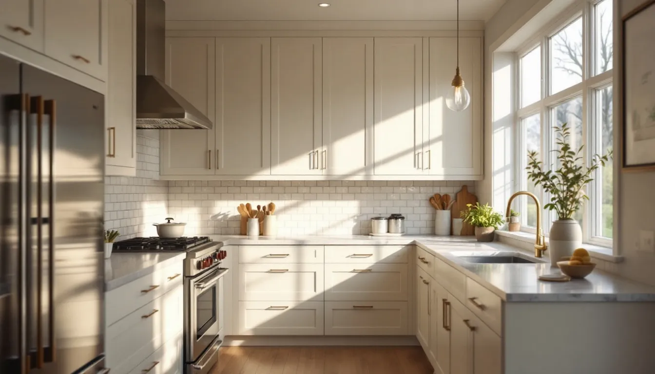
Creamy’s versatility as a paint color makes it a standout choice across a wide range of design styles and current trends. In farmhouse and traditional kitchens, creamy white walls or cabinets paired with wood floors and abundant natural light create a classic, welcoming look that never goes out of style. The soft warmth of Creamy complements white cabinets and trim color, adding depth and character without overpowering the space.
For coastal-inspired interiors, Creamy works beautifully with light, breezy decor and natural textures, enhancing the relaxed, sunlit vibe. In modern kitchens, Creamy can be used as a trim color or on an accent wall to introduce warmth and contrast against sleek surfaces and minimalist cabinetry. Its subtle undertones make it a perfect backdrop for both bold and understated decor choices.
Rustic and vintage-inspired spaces also benefit from Creamy’s warm undertones, especially when paired with distressed wood, antique hardware, and vintage accessories. The color’s ability to adapt to different lighting and decor styles makes it a go-to for designers looking to create a cozy, inviting atmosphere.
One of the most popular trends right now is the hygge-inspired home, which emphasizes comfort, warmth, and a sense of well-being. Creamy is an ideal paint color for achieving this look, as it envelops rooms in a soft, welcoming glow that encourages relaxation and togetherness.
Room-by-Room Applications
Each room type presents unique considerations for using Creamy effectively. Understanding these specific requirements helps ensure the color performs beautifully throughout your home while addressing the practical needs of different spaces.
Paint finish recommendations vary by room based on durability requirements, moisture levels, and desired aesthetic effects. Higher-traffic areas benefit from more durable finishes, while bedrooms can use flatter finishes for a softer, more luxurious appearance.
Lighting considerations change dramatically between room types, with kitchens typically having bright task lighting, bedrooms requiring warm ambient lighting, and bathrooms needing bright but flattering illumination.
Living Rooms and Creamy
Living rooms provide ideal conditions for showcasing Creamy’s versatility and warmth. The color creates inviting atmospheres perfect for entertaining and daily family life while providing an excellent backdrop for furniture and artwork.
For living room applications, eggshell or satin finishes offer the best balance of durability and appearance. These finishes provide subtle sheen that enhances light reflection while offering easy maintenance for high-traffic spaces.
Coordination with furniture works beautifully across various styles. Warm wood tones, leather upholstery, and natural textiles all complement Creamy’s undertones, while the color also provides an excellent backdrop for colorful artwork and accessories.
Balance Creamy’s warmth by incorporating cooler accent colors through pillows, artwork, and accessories. This prevents the space from feeling too monochromatic while maintaining the cozy atmosphere that makes Creamy so appealing.
Bedrooms with Creamy Paint
Bedrooms benefit tremendously from Creamy’s warm, restful character. The color creates cozy environments that feel peaceful and inviting, perfect for relaxation and sleep. Flat or eggshell finishes work best in bedrooms, providing a soft, luxurious appearance that enhances the room’s calm atmosphere.
Creamy performs exceptionally well in bedrooms with limited natural light, where its warm undertones prevent the space from feeling cold or stark. The color works equally well as an accent wall behind a bed or throughout the entire room.
Coordination with bedding and decor offers endless possibilities. White and cream linens create serene, hotel-like atmospheres, while colored bedding in soft blues, greens, or corals adds personality without overwhelming the peaceful character.
Consider the bedroom’s lighting when choosing Creamy. Rooms with warm bedside lighting will enhance the color’s cozy character, while those with cooler overhead lighting will show a more neutral side of the color.
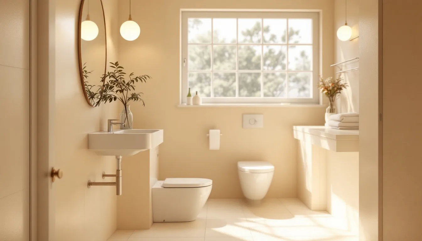
Bathrooms and Creamy
Bathroom applications require careful consideration of Creamy’s performance in typically cooler lighting conditions. The color works beautifully in bathrooms with adequate natural light, creating spa-like atmospheres that feel clean and serene.
Satin or semi-gloss finishes are essential in bathrooms to provide necessary moisture resistance and easy cleaning. These finishes also enhance light reflection, which is particularly beneficial in smaller bathroom spaces.
Coordination with fixtures and tiles requires attention to undertones. Creamy works beautifully with warm-toned stones and tiles but may clash with very cool grays or stark white fixtures. Consider the overall color temperature of your bathroom materials when selecting Creamy.
Ventilation becomes particularly important with darker, warmer colors in bathrooms. Ensure adequate ventilation to prevent humidity issues that could affect the paint’s appearance and longevity.
Room Size and Layout: How Creamy Impacts Space
The impact of Creamy on a room’s size and layout is remarkable. In smaller rooms, this light off white paint color helps bounce light around, making the space feel larger, brighter, and more open. Creamy’s subtle warmth prevents small spaces from feeling sterile, instead creating a welcoming and airy atmosphere.
In larger rooms, Creamy works to bring a sense of coziness and intimacy. Its warm undertones help soften expansive spaces, making them feel more inviting and comfortable. When used on kitchen cabinets and walls, Creamy can create a seamless, unified look that ties the room together, especially when paired with similar colors and wood tones.
For open-concept layouts, using Creamy throughout helps establish flow and continuity from one area to the next. The color’s versatility means it pairs well with a variety of wood finishes and other neutral shades, allowing you to create a harmonious palette that feels cohesive and thoughtfully designed. Whether you’re working with a compact kitchen or a spacious living area, Creamy adapts beautifully to the unique needs of your space.
Accent Walls and Creative Color Pairings with Creamy
Creamy is a fantastic choice for accent walls and creative color pairings, thanks to its ability to complement both warm and cool tones. As an accent wall, Creamy adds a gentle touch of warmth and contrast, especially when set against cooler paint colors like soft blues or sage greens. This combination brings balance and visual interest to any room.
For a harmonious look, pair Creamy with other warm tones such as beige, taupe, or warm gray. These combinations create a cozy, layered effect that’s perfect for living rooms, bedrooms, or kitchens. If you’re looking to add a pop of color, Creamy also works well with brighter shades like yellow or orange, resulting in a playful and energetic atmosphere.
Some favorite pairings include Sherwin Williams Dover White, which offers a lovely contrast between warm and cool undertones, and Benjamin Moore Simply White for a crisp, clean look. Creamy’s versatility means you can experiment with a wide range of other colors, from deep greens to soft blushes, to create a space that reflects your personal style while maintaining a sense of warmth and cohesion.
Testing Sherwin Williams Creamy: Samples and Swatches
Before you commit to painting an entire room with Sherwin Williams Creamy, it’s crucial to test the color in your own space. Lighting situations—both natural light and artificial—can dramatically affect how Creamy appears on your walls or cabinets. Start by purchasing a sample pot and painting swatches on different walls to see how the color shifts throughout the day.
Pay close attention to how Williams Creamy looks in morning sunlight, afternoon shade, and under your home’s lighting at night. This will help you determine if the undertones and overall effect are what you’re looking for. Don’t forget to test the color next to your existing finishes, such as wood floors, countertops, and trim, to ensure everything coordinates beautifully.
For added confidence, use online visualization tools or paint apps to preview how Creamy will look in your room. Taking the time to sample and observe Creamy in your unique lighting and space will help you make a decision you’ll be happy with for years to come, ensuring your painting project results in a space you truly love.
Common Mistakes to Avoid with Creamy
Many homeowners make the mistake of choosing Creamy without testing it thoroughly in their specific lighting conditions. What looks perfect in the store or online may appear too yellow, too gray, or washed out in your actual space, making sampling absolutely essential.
Very bright, south-facing rooms can overwhelm Creamy’s undertones, causing the color to appear washed out or overly yellow. In these situations, testing large samples throughout different times of day helps determine whether the color will work or if a different option would be better.
Mismatched undertones with existing finishes create one of the most common problems with Creamy. If your floors, countertops, or major furnishings have cool undertones, Creamy’s warmth may clash rather than coordinate, creating an uncomfortable visual tension.
Ignoring the importance of artificial lighting often leads to disappointment. Room lighting significantly affects how Creamy appears in the evening, and many homeowners are surprised by how different the color looks under warm incandescent bulbs versus cool LED fixtures.
Another frequent mistake involves using Creamy in spaces where pure white or cooler off whites would be more appropriate. While Creamy is wonderfully versatile, it’s not universally flattering, and some design styles or room configurations benefit from different color approaches.
The most successful Creamy applications result from careful consideration of lighting, existing finishes, desired atmosphere, and specific room requirements. Taking time to evaluate these factors before committing to the color ensures beautiful, lasting results that you’ll love for years to come.
When done thoughtfully, Sherwin Williams Creamy creates warm, sophisticated spaces that strike the perfect balance between brightness and coziness. Its versatility, combined with careful application, makes it an excellent choice for homeowners seeking a dependable, beautiful neutral that brings life and warmth to any space. Many homeowners find great success when working with one of our designers to incorporate Creamy into their kitchen, ensuring the color complements their cabinetry, countertops, and overall design vision perfectly.