
Transform Your Space with SW Urbane Bronze: Design Tips and Ideas
Sherwin Williams Urbane Bronze: The Complete Guide to This Sophisticated Dark Greige
When Sherwin Williams named Urbane Bronze their 2021 Color of the Year, they recognized what designers and homeowners had already discovered: this sophisticated dark greige offers the perfect balance of warmth and drama for modern spaces. Whether you’re considering urbane bronze painted cabinets for your kitchen renovation or hoping to transform your home’s exterior, this versatile paint color delivers stunning results that stand the test of time.
In this comprehensive guide, you’ll learn everything you need to know about SW Urbane Bronze (SW 7048), from understanding its complex undertones to discovering the best applications for your space. We’ll explore how this rich paint color can complement your existing décor, what colors pair beautifully with it, and provide expert tips for achieving professional-looking results in your own home.
What is Sherwin Williams Urbane Bronze?
Sherwin Williams Urbane Bronze (SW 7048) is a sophisticated dark greige paint color that was named Color of the Year 2021. This distinction wasn’t awarded lightly – Sherwin Williams recognized that homeowners were gravitating toward colors that offered both comfort and complexity during uncertain times.
This versatile paint combines warm brown and cool gray tones with subtle green undertones, creating a rich, multi-dimensional color that shifts beautifully throughout the day. Unlike traditional grays that can feel cold or sterile, Urbane Bronze maintains warmth while providing the sophistication that modern homeowners desire.
The color features a very low Light Reflectance Value (LRV) of 8, making it one of the darker paint colors in the greige family. This low LRV contributes to its dramatic impact and cozy atmosphere, though it also means careful consideration is needed when deciding where to use this stunning paint.
Urbane Bronze offers a velvety, rich appearance that adds depth and elegance to any space. Whether used on kitchen cabinets, as an accent wall, or on exterior doors, this paint color creates an immediate sense of luxury and refinement that’s hard to achieve with lighter paint colors.
Understanding Urbane Bronze’s Color Profile and Undertones
The beauty of Urbane Bronze lies in its complexity. This isn’t a simple gray or brown – it’s a carefully balanced greige that shifts between brown and gray depending on lighting conditions. Understanding these nuances is crucial for successfully incorporating this paint into your space.
The primary classification of Urbane Bronze is as a warm greige, but its character changes dramatically based on the light it receives. In north-facing rooms with cooler light, the gray base becomes more pronounced, creating a sophisticated, moody atmosphere. Conversely, in south-facing spaces with warm natural light, the brown undertones emerge more strongly, making the color feel rich and enveloping.
The dominant green undertones become more apparent in natural light, particularly during different times of day. This green influence prevents the color from feeling flat or one-dimensional, instead adding an organic quality that connects beautifully with natural materials like wood and stone. These green undertones are what make Urbane Bronze feel fresh rather than heavy, despite its dramatic depth.
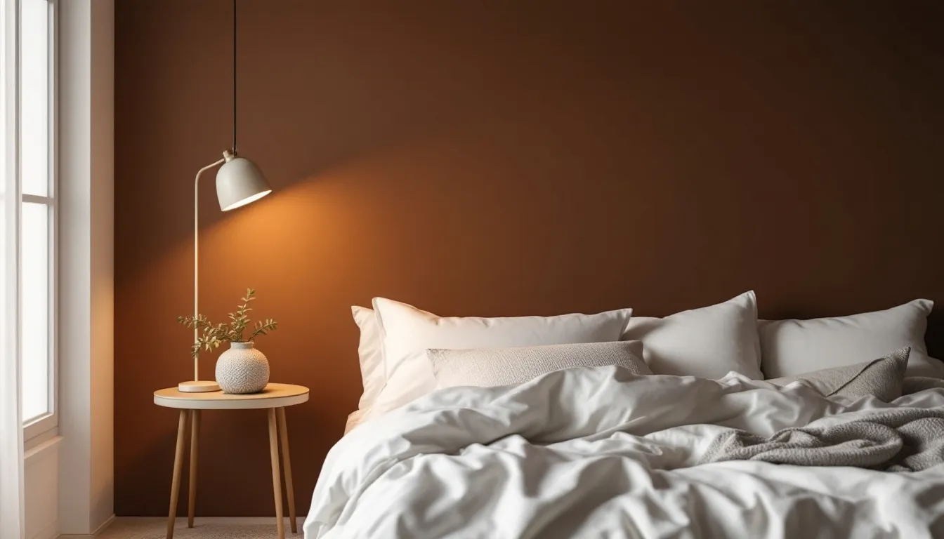
Secondary brown undertones emerge in warm, south-facing rooms, creating a cozy, cocoon-like feeling that’s perfect for bedrooms or intimate dining spaces. The interplay between these brown notes and the underlying gray creates the sophisticated balance that has made this paint color so popular among designers and homeowners alike.
How lighting affects the color’s appearance throughout the day is something every homeowner should consider. Morning light might emphasize the cooler gray tones, while afternoon sun could bring out the warmer brown and green notes. This shifting quality isn’t a flaw – it’s one of Urbane Bronze’s greatest strengths, ensuring your space never feels static or boring.
Light Reflectance Value (LRV) and What It Means
Urbane Bronze’s LRV of 8 places it firmly in the category of very dark paint colors. To put this in perspective, pure black has an LRV of 0, while pure white measures 100. Most paint colors fall somewhere between 20 and 80, making Urbane Bronze significantly darker than many popular choices.
This low LRV affects room brightness and atmosphere in important ways. Darker colors absorb light rather than reflecting it, which means rooms painted in Urbane Bronze will feel more intimate and cozy. This can be exactly what you want for creating a dramatic accent wall or sophisticated kitchen cabinets, but it requires careful planning for overall room lighting.
Best practices for using dark colors with low LRV in different spaces include ensuring adequate artificial lighting and balancing the darkness with lighter elements. In a kitchen with urbane bronze cabinets, for example, you might choose light-colored walls, bright white trim, and plenty of under-cabinet lighting to maintain functionality while enjoying the color’s dramatic impact.
Room size and natural light requirements become crucial considerations with such a dark paint color. Smaller rooms or spaces with limited natural light might feel overwhelming if painted entirely in Urbane Bronze. However, these same spaces can benefit from strategic use of the color on a single accent wall or built-in features.
The key is understanding that low LRV doesn’t mean unusable – it simply means thoughtful application. Many homeowners have successfully used Urbane Bronze in smaller bedrooms or powder rooms by pairing it with crisp white trim and ensuring adequate lighting.
Best Applications for Urbane Bronze
The versatility of Urbane Bronze shines through in its wide range of successful applications. From interior features to exterior elements, this sophisticated paint color elevates whatever surface it graces.
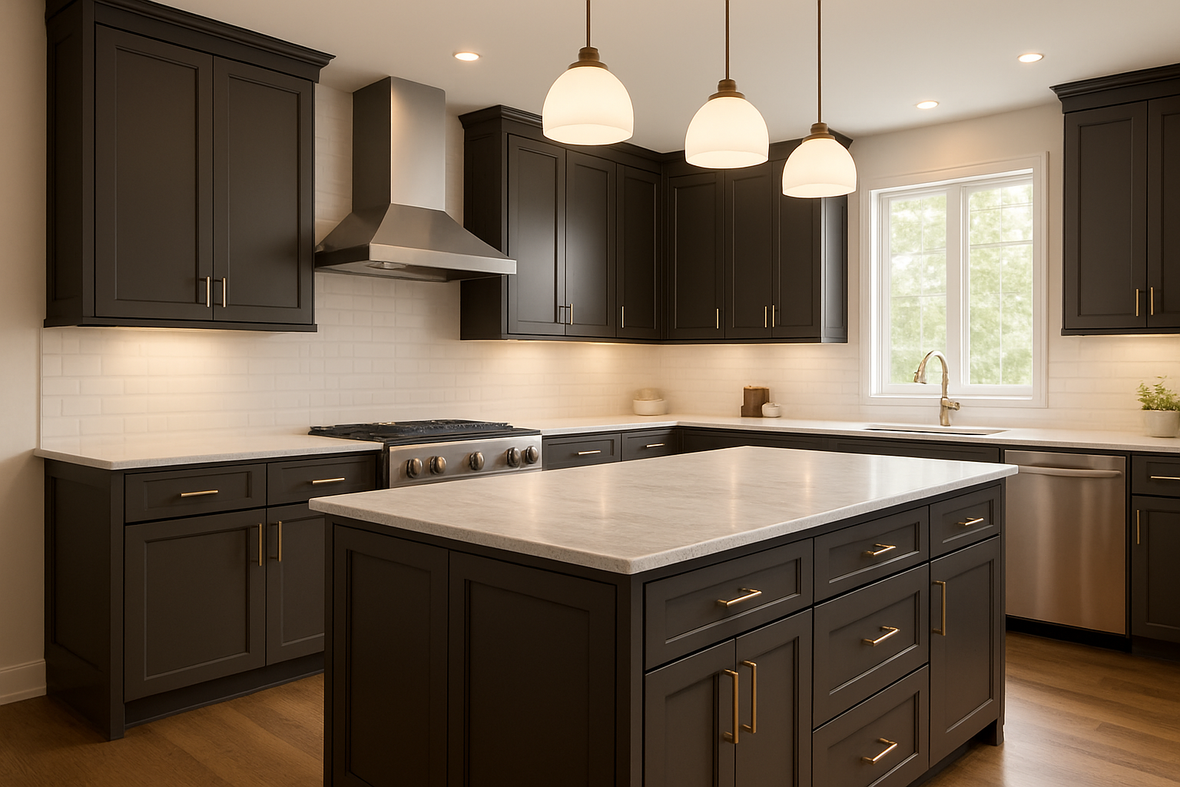
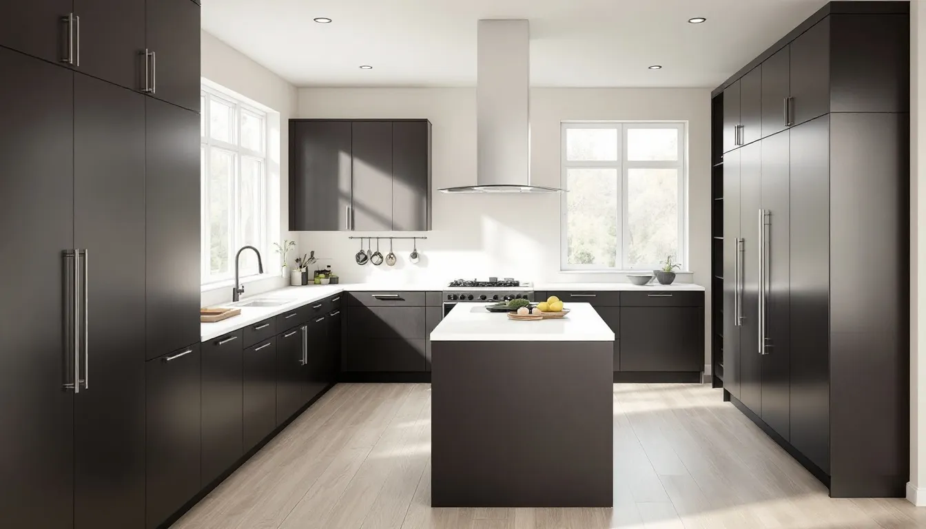
Kitchen cabinets and islands represent one of the most popular applications for Urbane Bronze. The color’s depth creates a stunning focal point in modern kitchens, while its warm undertones prevent it from feeling cold or unwelcoming. When used on a kitchen island, Urbane Bronze creates a beautiful contrast against lighter perimeter cabinets, adding visual interest without overwhelming the space.
Bathroom vanities and built-in storage benefit from Urbane Bronze’s sophisticated character. The color works particularly well in master bathrooms where you want to create a spa-like atmosphere. Its low LRV actually works to your advantage in bathrooms, creating an intimate, cozy feeling that transforms daily routines into luxurious experiences.
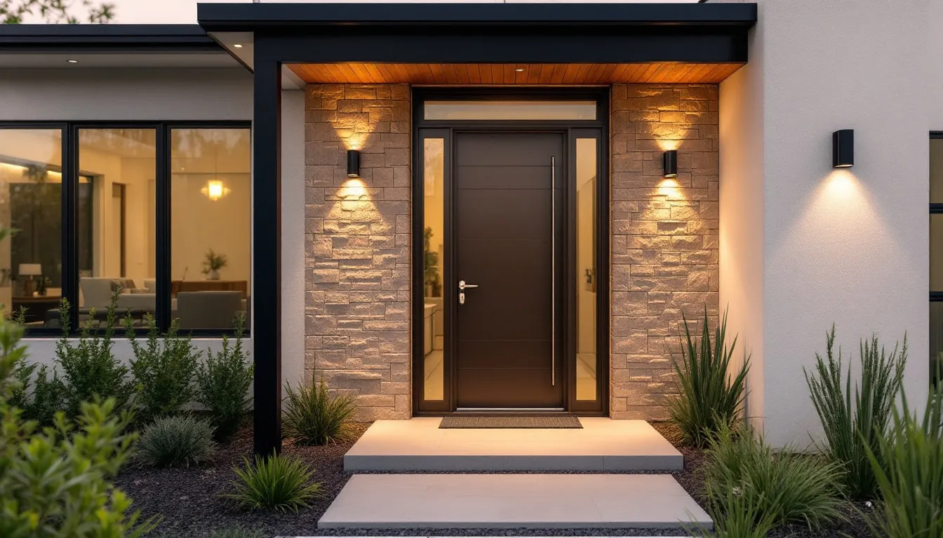
Exterior applications including front doors, shutters, and trim showcase Urbane Bronze’s versatility beyond interior spaces. A front door painted in this rich color creates stunning curb appeal and signals sophisticated taste to visitors. The color’s complex undertones complement both traditional and modern architectural styles, making it a safe choice for exterior updates.
Accent walls in living rooms and bedrooms provide an opportunity to enjoy Urbane Bronze’s drama without committing to painting an entire room. A single accent wall can anchor furniture arrangements and create a sophisticated backdrop for artwork or built-in shelving.
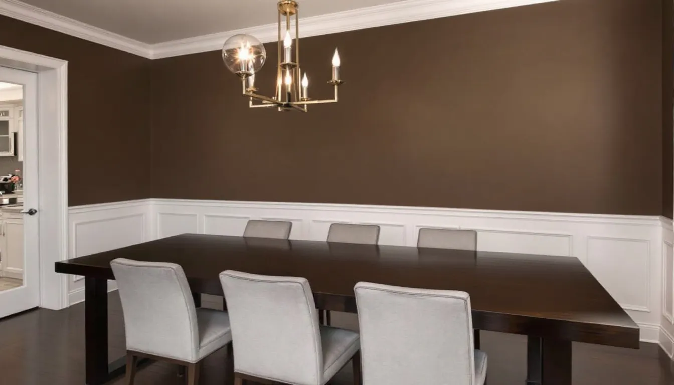
Dining room feature walls and wainscoting represent another excellent application. The intimate atmosphere created by this dark paint color enhances the dining experience, making meals feel more special and conversation more intimate.
Urbane Bronze on Kitchen Cabinets
Urbane Bronze works exceptionally well for kitchen cabinetry because it strikes the perfect balance between dramatic and practical. Unlike pure black, which can show fingerprints and wear more readily, the complex undertones in Urbane Bronze help mask everyday use while maintaining its sophisticated appearance.
The best hardware finishes to complement Urbane Bronze cabinets include warm metals like brass and aged bronze, which echo the color’s underlying warmth. Brushed nickel and stainless steel also work well, particularly in contemporary kitchens where you want a cleaner, more modern look. Black hardware creates a subtle, sophisticated appearance that lets the cabinet color take center stage.
Countertop materials that pair beautifully with Urbane Bronze include various quartz options, particularly those with warm undertones or subtle veining. White and cream quartz creates a striking contrast that keeps the kitchen feeling bright and functional. Natural granite in warm tones complements the color’s organic feeling, while marble options can add luxury and lightness to balance the cabinets’ depth.
Backsplash ideas that enhance Urbane Bronze’s undertones include subway tiles in warm white or cream, natural stone tiles that echo the color’s earthy quality, or even metallic tiles that play off the “bronze” aspect of the color name. The key is choosing materials that complement rather than compete with the cabinets’ sophisticated character.
When planning urbane bronze cabinets, consider the overall balance of your kitchen. If you choose this color for all your cabinetry, ensure you have adequate lighting and lighter elements like walls, ceiling, and countertops to prevent the space from feeling too dark or closed-in.
Perfect Color Combinations with Urbane Bronze
Creating a cohesive color palette around Urbane Bronze requires understanding which colors enhance its sophisticated character while providing necessary contrast and balance.
White trim colors that complement Urbane Bronze include several excellent options from both Sherwin Williams and other manufacturers. Pure White by Sherwin Williams offers a crisp, clean contrast that makes Urbane Bronze appear even richer. Alabaster provides a slightly warmer white that harmonizes beautifully with the color’s undertones. Benjamin Moore’s White Dove is another popular choice that offers enough warmth to complement without competing.
Coordinating wall colors for a cohesive palette depend on your desired mood and the room’s function. Lighter greiges like Accessible Beige or Natural Linen create a sophisticated monochromatic scheme that lets Urbane Bronze take center stage. For contrast, warm whites or soft creams provide brightness while maintaining harmony with the color’s warm undertones.
Accent colors that enhance Urbane Bronze’s green undertones include soft sage greens, muted blues, and warm terracotta tones. These colors create interesting combinations without overwhelming the sophisticated base that Urbane Bronze provides. Rich jewel tones like deep emerald or navy can also work beautifully in small doses through accessories or artwork.
Neutral companions for a sophisticated monochromatic scheme include various taupes, mushroom grays, and warm beiges. These colors create depth and interest while maintaining the calming, grounded feeling that makes Urbane Bronze so appealing. The key is choosing colors with similar undertones to create harmony rather than conflict.
When selecting colors to pair with Urbane Bronze, always test your combinations in the actual space where they’ll be used. Lighting conditions can dramatically affect how colors appear together, and what looks perfect on a paint sample might not work as well in your specific room.
Exterior Color Schemes with Urbane Bronze
Roof colors that work well with Urbane Bronze siding or trim include various shades of gray, brown, and even black. Charcoal gray roofs create a sophisticated, modern look, while brown tones complement the color’s warm undertones. The key is ensuring enough contrast so the elements don’t blend together into one dark mass.
Stone and brick combinations that complement the color’s undertones include warm limestone, sandstone, and brick in earthy red or brown tones. These natural materials echo Urbane Bronze’s organic feeling and create beautiful textural interest. Avoid cool-toned stones or stark white brick, which can clash with the color’s warm character.
Landscaping considerations to enhance Urbane Bronze exteriors include plants with complementary foliage colors. Green plants naturally enhance the color’s subtle green undertones, while plants with bronze or burgundy foliage create beautiful harmony. Avoid plants with blue-green or silvery foliage, which can emphasize any cool undertones and make the color appear less warm.
Regional climate considerations for exterior durability matter when choosing any dark paint color. In very hot, sunny climates, dark colors can fade more quickly and may make cooling costs higher. However, Urbane Bronze’s complex undertones tend to age more gracefully than pure black or other solid dark colors.
Similar Colors and Alternatives to Urbane Bronze
Understanding how Urbane Bronze compares to similar colors helps ensure you’re choosing the right option for your specific project and preferences.
Sherwin Williams alternatives include Iron Ore (SW 7069), which leans more toward pure black with blue undertones, making it cooler and more dramatic than Urbane Bronze. Black Fox (SW 7020) offers similar depth but with different undertones that may work better in certain lighting conditions or with specific décor styles.
Benjamin Moore comparisons include Wrought Iron (HC-175), which provides similar depth but with cooler undertones that some homeowners prefer. Chelsea Gray (HC-168) offers a lighter option that still provides sophistication but with less drama than Urbane Bronze’s low LRV.
How to choose between similar dark greige options depends on your specific goals and space. If you want maximum warmth and organic feeling, Urbane Bronze is hard to beat. If you prefer something slightly cooler or lighter, one of the alternatives might work better for your space and style preferences.
Color matching considerations for different paint brands become important if you’re working with multiple paint manufacturers or need to coordinate with existing colors. While many stores can match colors across brands, subtle differences in undertones and finish can affect the final result. Always test matched colors in your specific lighting conditions before committing to large areas.
The popularity of Urbane Bronze has led to many similar offerings from other paint manufacturers, but the specific balance of undertones that makes this color so appealing can be difficult to replicate exactly. If you love the way Urbane Bronze looks in photos or samples, it’s usually worth sticking with the original rather than trying to find a substitute.
Testing and Sampling Urbane Bronze
The importance of testing paint colors before committing to full application cannot be overstated, especially with a color as complex and dark as Urbane Bronze. This sophisticated paint color can look dramatically different in various lighting conditions and spaces.
Using peel-and-stick samples (Samplize) for accurate color assessment provides a convenient way to see how Urbane Bronze looks in your space without the commitment of painting large sample patches. These samples are large enough to get a true sense of the color while being easy to move around the room to test different lighting conditions.
Testing in different lighting conditions throughout the day reveals how Urbane Bronze’s complex undertones shift with changing light. Place paint samples or swatches in the area where you plan to use the color and observe them in morning light, afternoon sun, and evening artificial light. You might be surprised at how different the color appears at different times.
Observing color interactions with existing furnishings and finishes helps ensure your new paint choice will work harmoniously with your current décor. Hold paint samples near your floors, countertops, furniture, and other fixed elements to see how the colors work together. What looks stunning in isolation might clash with your existing materials.
Professional color consultation services available through many paint retailers and independent designers can provide valuable expertise when you’re unsure about such a significant color choice. These professionals understand how colors work in different spaces and can help you avoid costly mistakes.
Consider testing Urbane Bronze in the specific finish you plan to use, as different sheens can affect how the color appears. A satin finish might show the color’s depth differently than an eggshell or semi-gloss finish, and these differences can impact your final satisfaction with the choice.
Tips for Successfully Using Urbane Bronze
Room size considerations and how to make dark colors work in smaller spaces require careful planning but can yield stunning results. In smaller rooms, consider using Urbane Bronze on just one accent wall or built-in features rather than painting all walls. This approach provides the color’s sophisticated impact without overwhelming the space.
Lighting strategies to enhance Urbane Bronze’s beauty include layering different types of light sources. Combine ambient lighting, task lighting, and accent lighting to ensure the space remains functional while highlighting the color’s rich depth. Under-cabinet lighting in kitchens with urbane bronze cabinets is particularly important for maintaining workability.
Balancing dark colors with lighter elements in the room creates visual interest and prevents the space from feeling too heavy or closed-in. Use white or light-colored trim, choose lighter wall colors if using Urbane Bronze on cabinets, and incorporate light-colored accessories and furnishings to create balance.
Maintenance and touch-up considerations for dark paint colors include understanding that scuffs and marks may show more readily on dark surfaces. Keep some paint reserved for touch-ups, and consider the room’s traffic level when deciding where to use this sophisticated color. High-traffic areas may need more frequent maintenance.
Professional painting tips for achieving the best finish include using high-quality brushes and rollers designed for the specific paint finish you’ve chosen. Dark colors can show brush marks or roller marks more readily than lighter colors, so proper technique and quality tools are essential for professional-looking results.
Consider the psychological impact of dark colors when planning your space. While Urbane Bronze creates a sophisticated, cozy atmosphere, some family members might find very dark spaces overwhelming. Balance dramatic elements with lighter, more open areas to ensure everyone feels comfortable in the space.
The journey of choosing and successfully implementing Urbane Bronze in your home requires careful consideration of multiple factors, from understanding its complex color profile to planning appropriate lighting and complementary colors. This sophisticated dark greige offers the perfect opportunity to create spaces that feel both dramatic and welcoming, contemporary and timeless.
Whether you’re installing urbane bronze painted cabinets in a kitchen renovation, creating a stunning accent wall in your bedroom, or adding curb appeal with a dramatic front door, this versatile paint color delivers results that feel both current and enduring. The key to success lies in understanding the color’s unique characteristics and planning your application thoughtfully.
As you move forward with your project, remember that the best results come from careful testing and consideration of your specific space’s lighting, size, and existing elements. Don’t rush the decision-making process – take time to observe how paint samples look in different conditions and gather input from family members who will live with the color daily.
The investment in proper planning and testing will pay off in years of satisfaction with your sophisticated color choice. Urbane Bronze has earned its place as a beloved paint color through its unique ability to provide drama without sacrificing warmth, making it an excellent choice for homeowners seeking to create spaces that feel both elegant and comfortable.
Closing Thoughts
Sherwin Williams Urbane Bronze is a sophisticated, versatile paint color that brings depth, warmth, and timeless elegance to any space. Whether you're considering urbane bronze painted cabinets for a kitchen renovation, an accent wall, or exterior features, this rich dark greige offers a perfect balance of drama and comfort. Its complex undertones and low LRV create a cozy yet refined atmosphere that enhances modern and traditional designs alike.
If you’re thinking about incorporating Urbane Bronze in your kitchen or home, we encourage you to work with one of our experienced designers. They can help you navigate color choices, lighting considerations, and complementary finishes to ensure your project turns out stunning and perfectly suited to your space. With expert guidance, you can confidently bring the beauty and sophistication of Urbane Bronze into your home.
Ready to transform your space? Contact us today to schedule a consultation and discover how Urbane Bronze can elevate your kitchen and beyond.
